Café el Olmo

Roles & Deliverables
Brand Design
Packaging Design
Art Direction


Brand Background

Nestled in the heart of a small Spanish town, Café El Olmo is a coffee brand rooted in tradition, craftsmanship, and community. Named after the elm tree (olmo in Spanish) a symbol of endurance and natural beauty. The café reflects a deep respect for the land and the people who cultivate it.

El Olmo’s mission is simple: to serve coffee that connects earth, aroma, and heart - “Tierra, Aroma & Corazón.” Each cup tells the story of slow roasting, locally sourced ingredients, and genuine care for quality. The rebrand elevates this essence into a timeless yet contemporary identity that honours both nature and heritage.

Logo

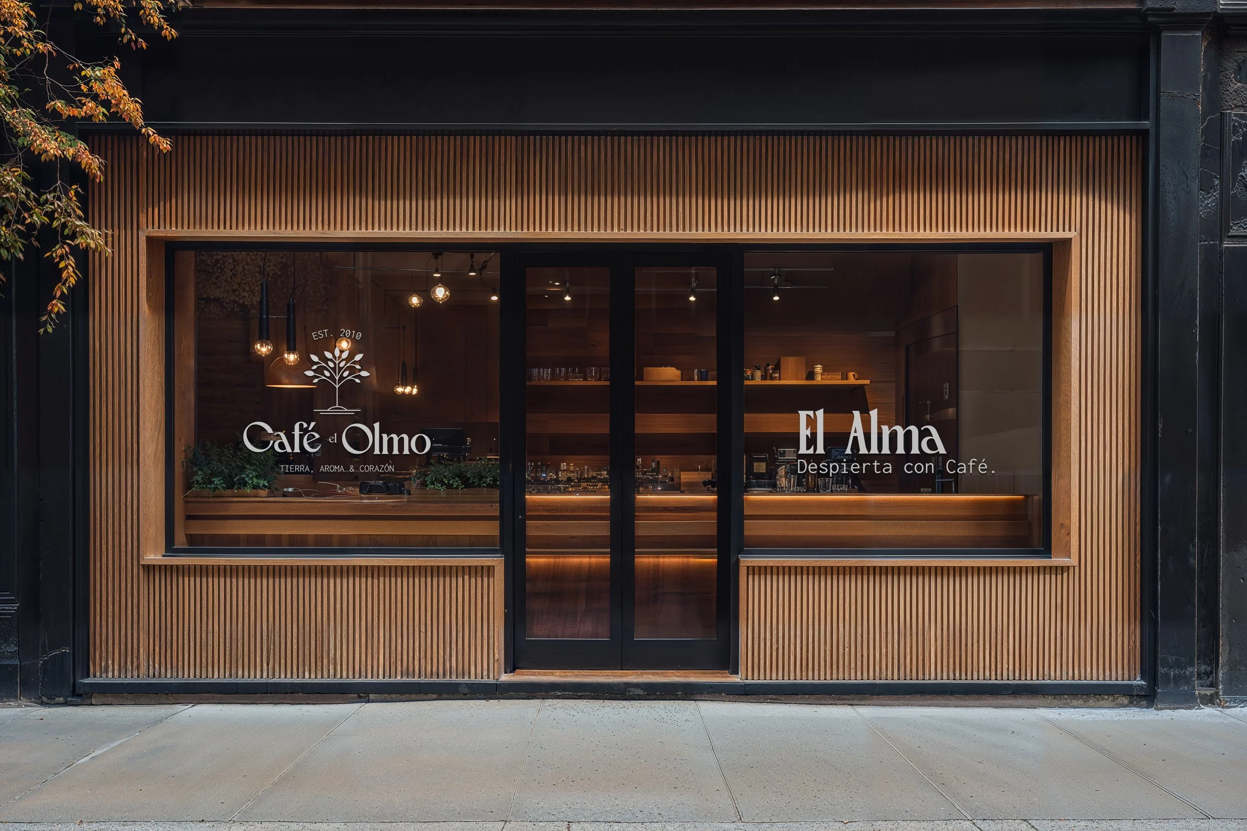
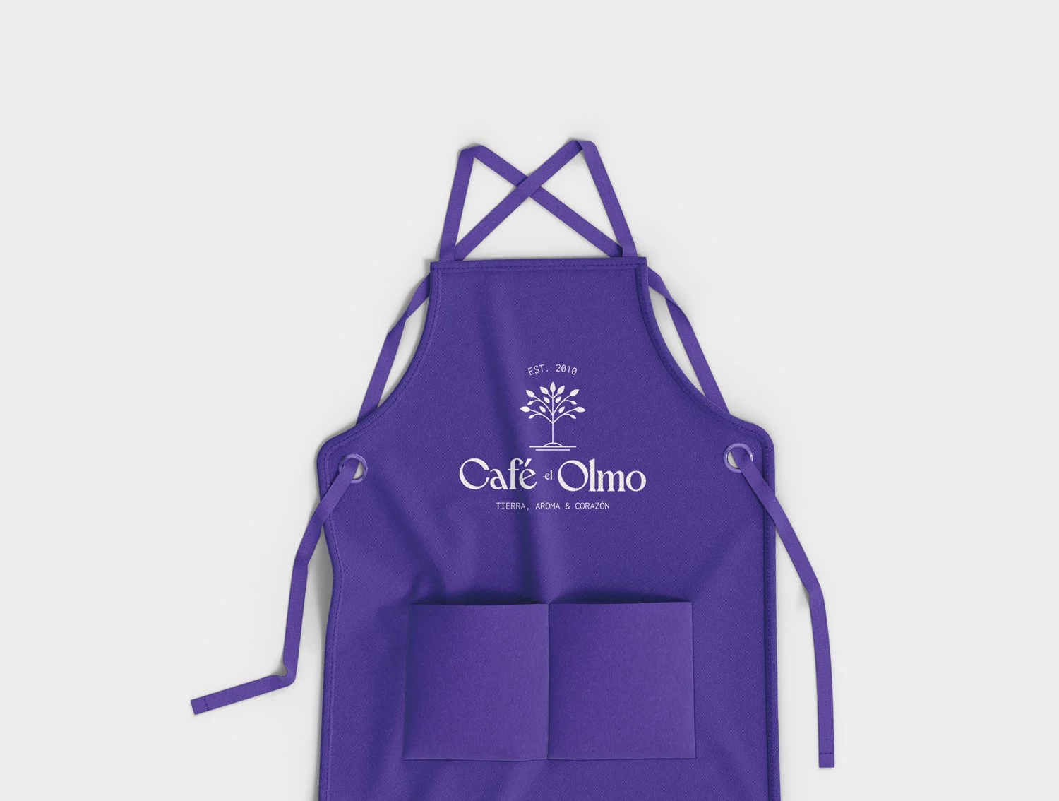
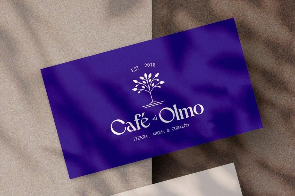
The Café El Olmo logo combines a refined serif wordmark with an elegant elm tree icon, creating a balance between natural warmth and timeless sophistication.

The elm tree symbol stands at the heart of the identity, a visual metaphor for roots, growth, and endurance.

Paired with the classic serif typography, the design evokes heritage, nature, and quiet confidence.

The elm tree mark anchors the brand; elegant, organic, and enduring. A symbol of the deep connection between Tierra, Aroma & Corazón.

Concept & Positioning

Café El Olmo is built around a simple but powerful idea — that great coffee is more than flavour; it’s connection. The brand stands for the harmony between earth, aroma, and heart, celebrating the craft of coffee as a grounded, sensory ritual.

Positioned between artisanal tradition and modern sophistication, El Olmo invites people to slow down, reconnect with their surroundings, and savour moments of calm.

Packaging

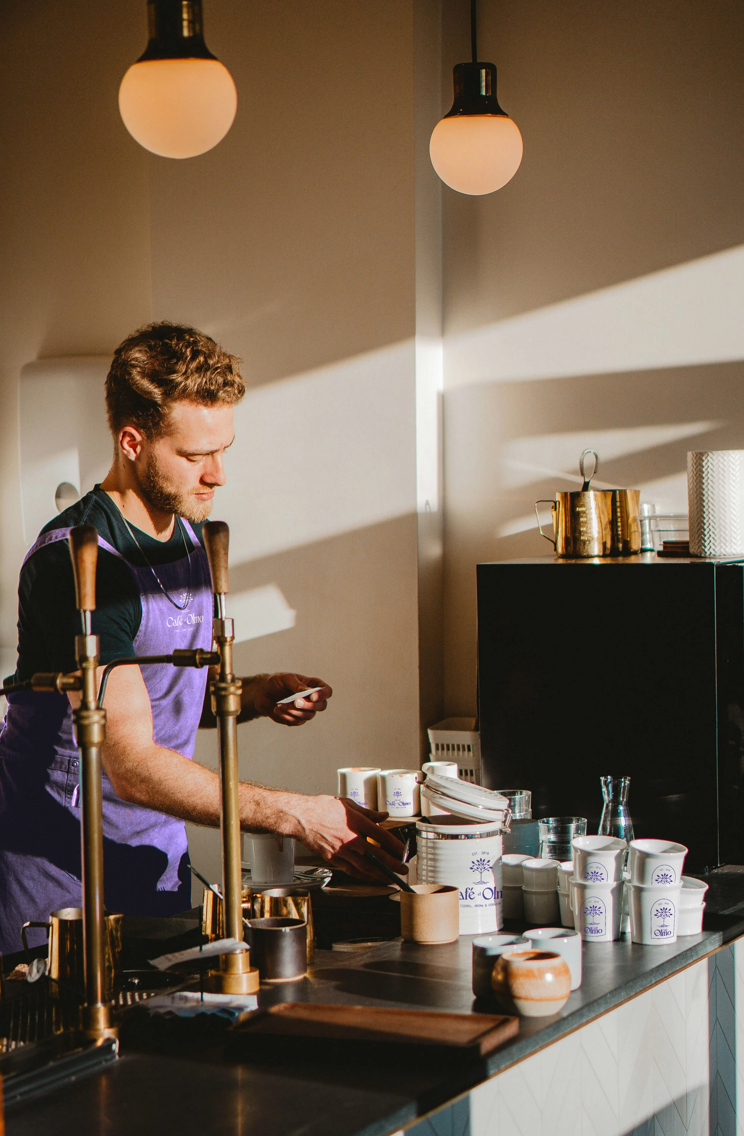
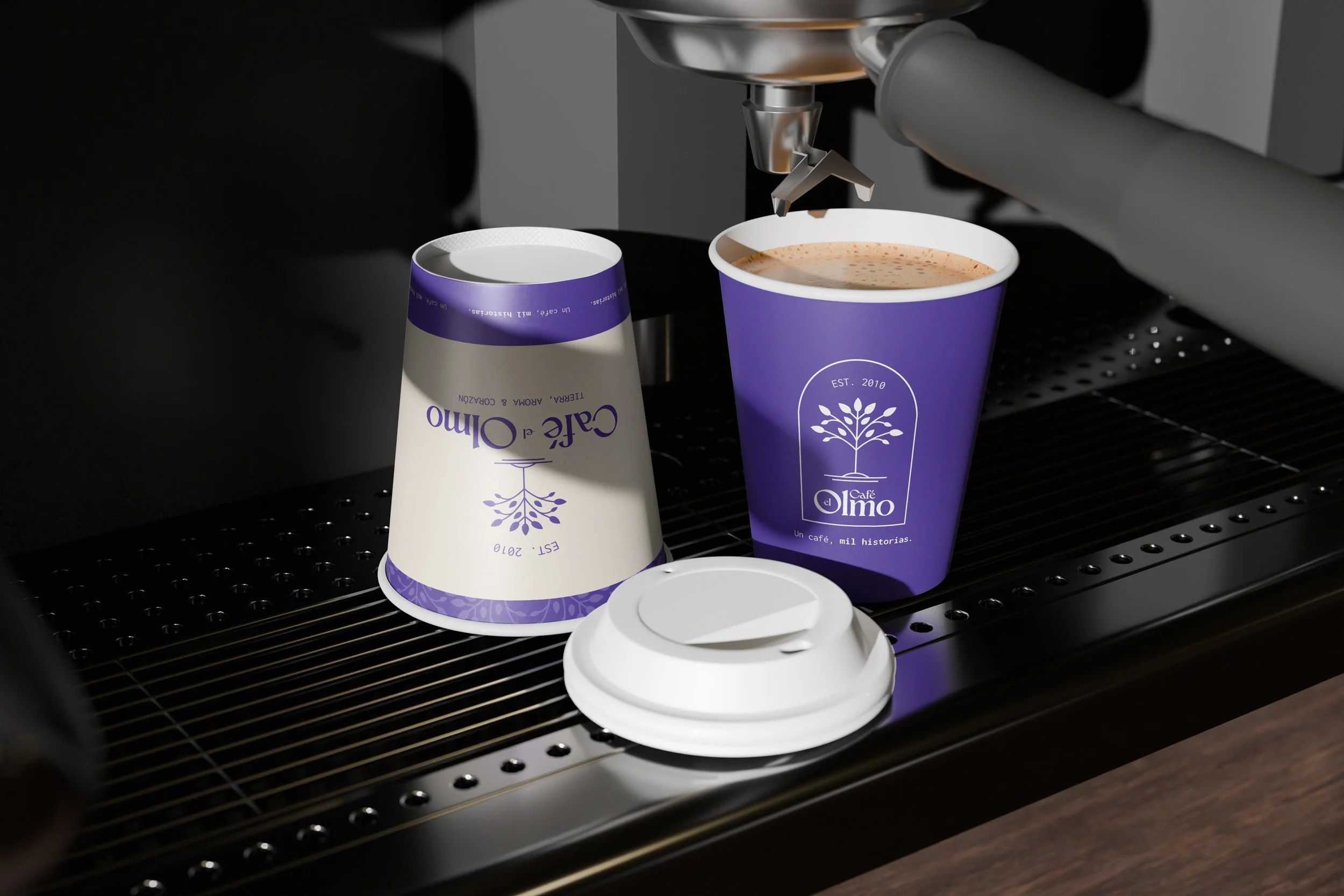
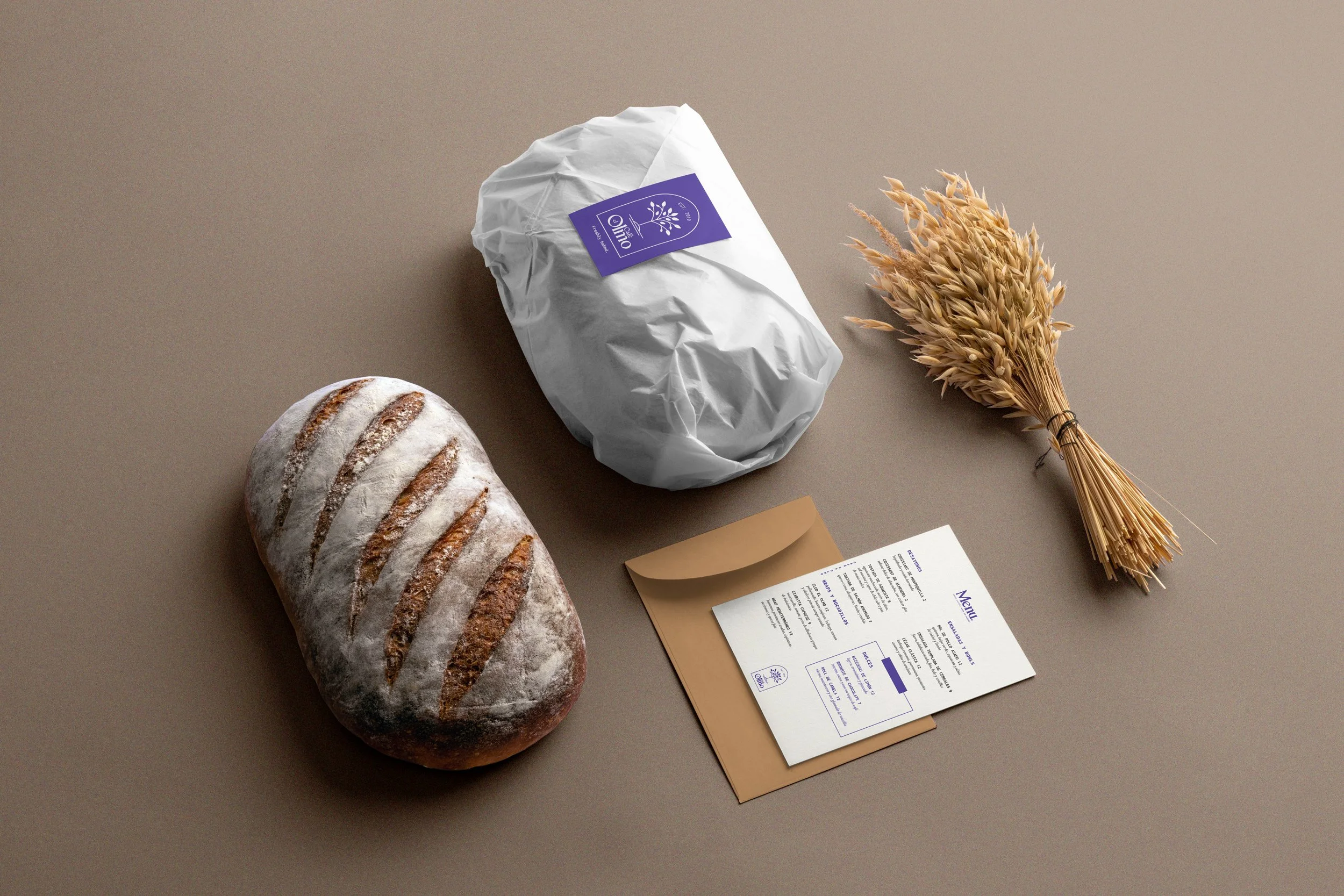
Keeping the logo at the forefront of the design helps customers immediately recognize the brand by its vibrant violet/blue.

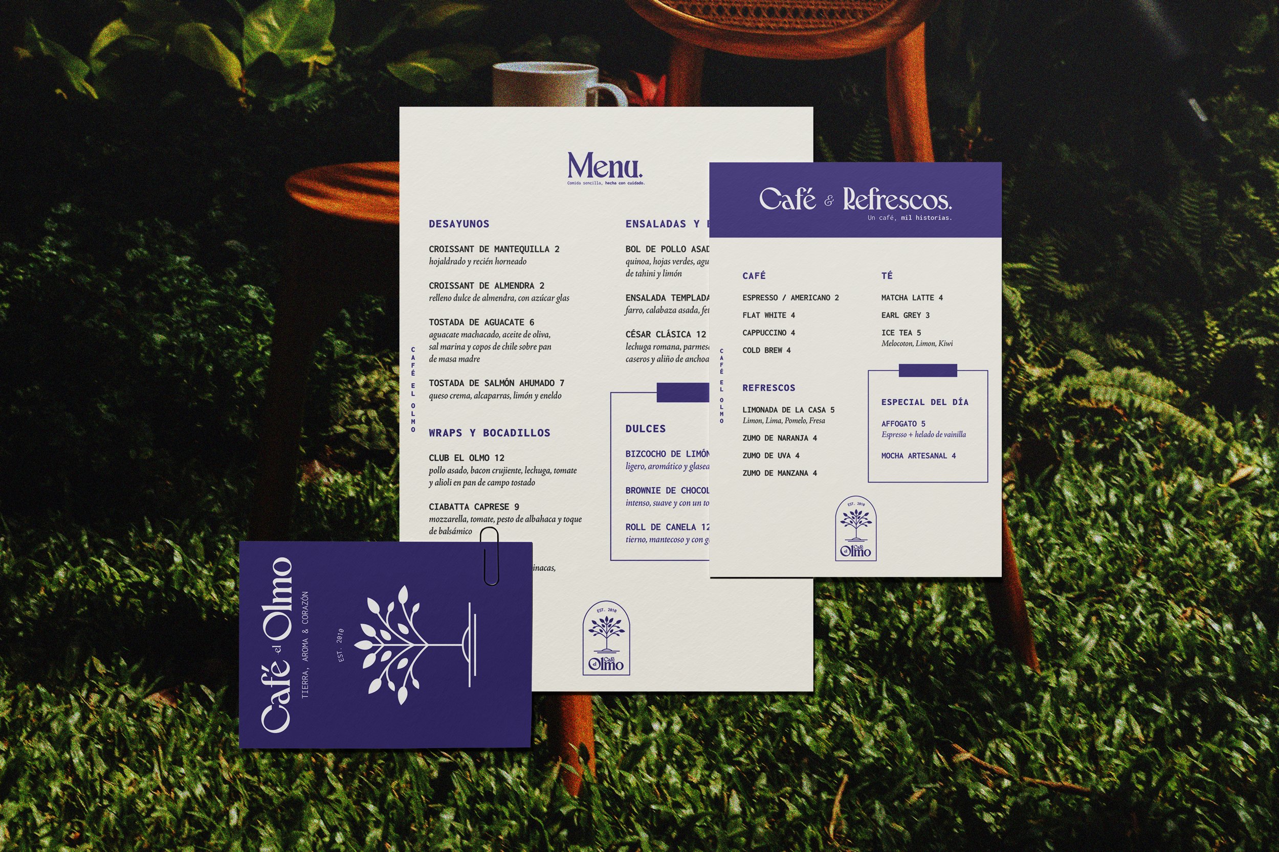
I kept the typography clean and intentional, letting the logo and colour palette carry most of the expression. Small details, like the inner message “Un café, mil historias.”, were added to create a more personal connection with each cup.

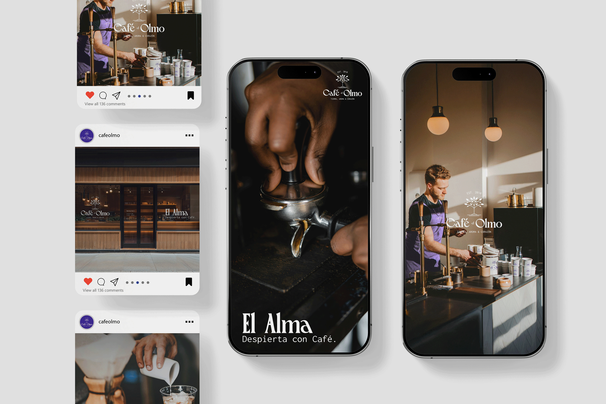
The goal was to make every touchpoint — from the takeaway cups to the printed cards — feel thoughtful and elevated, as if you were receiving something made with genuine care.

BACK TO TOP