Dalston’s
Roles & Deliverables
Brand Design
Packaging Design
Illustration
Brand Background
Dalston’s Coffee is a self-initiated project. A café concept rooted in drip coffee and creativity. I myself, amongst many others, love enjoying a warm cup of coffee (or maybe 2-3, if we’re being honest) in the morning. What started as a simple love for a good brew evolved into a character-led brand that brings personality to every cup.
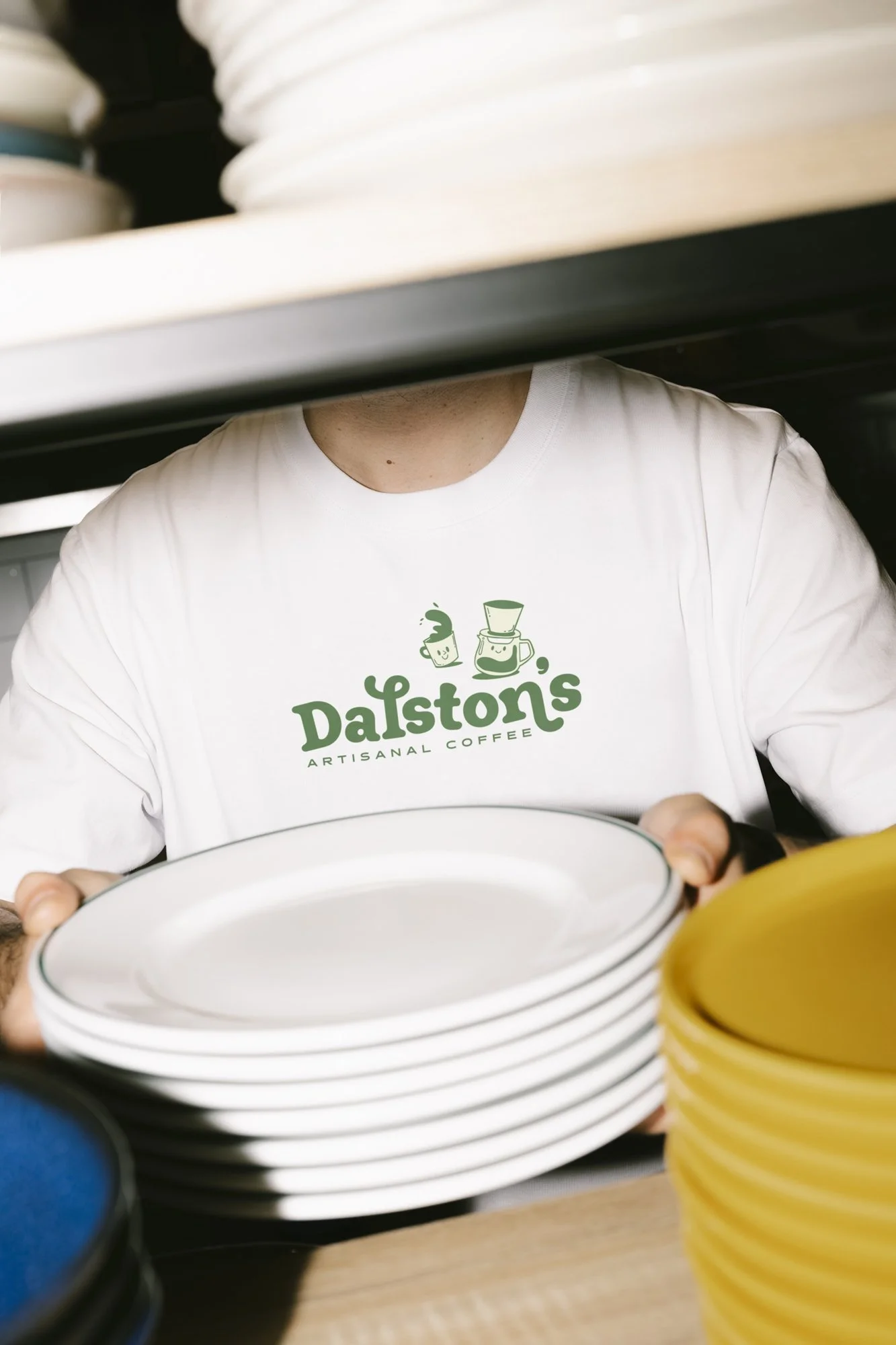
Craftsmanship sits at the heart of the brand, but never without play. The identity is driven by a cast of illustrated coffee cups and pots, each one expressing a different mood, giving Dalston’s its unmistakable charm and sense of storytelling.
The brand celebrates everyday coffee rituals through bold design, honest ingredients and a playful approach to craft. It’s coffee made with care, served with character..
Logo
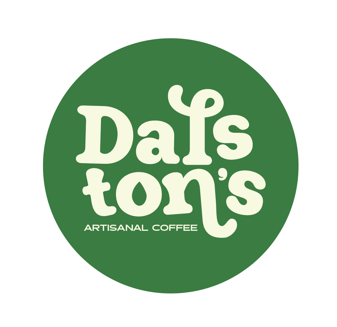
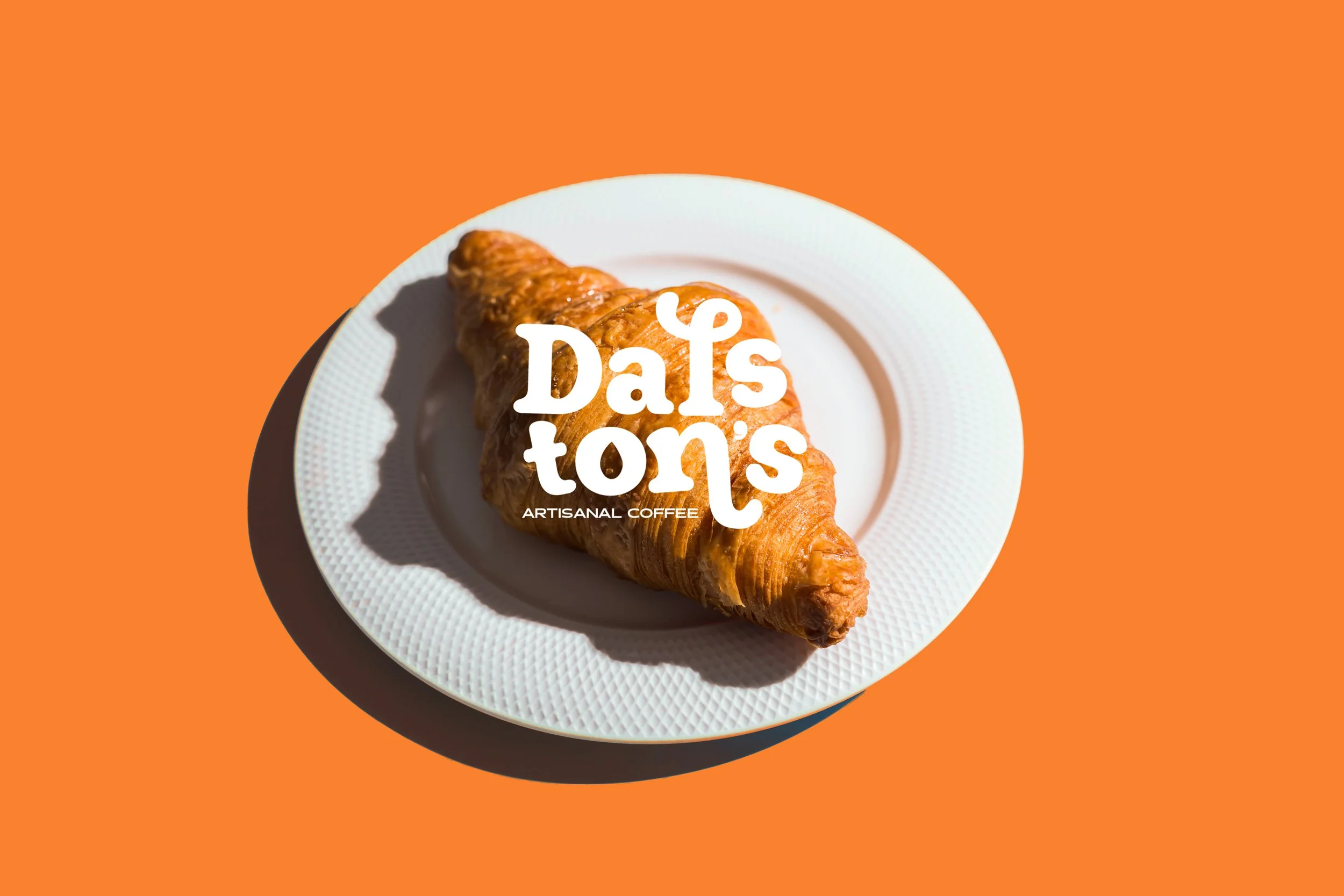
After many iterations, I refined the logo around three core ideas: playfulness, character and recognisability.
The rounded letterforms and individually positioned characters bring a sense of movement and personality. Nothing feels rigid or overly polished. Instead, the letters gently curve and lean as if hand-placed, giving the logo a natural and organic rhythm.
I also added a drip inside the O to reference the heart of the brand: drip coffee. Every element was designed with intention, creating a wordmark that feels warm, expressive and full of life.
Colour Palette
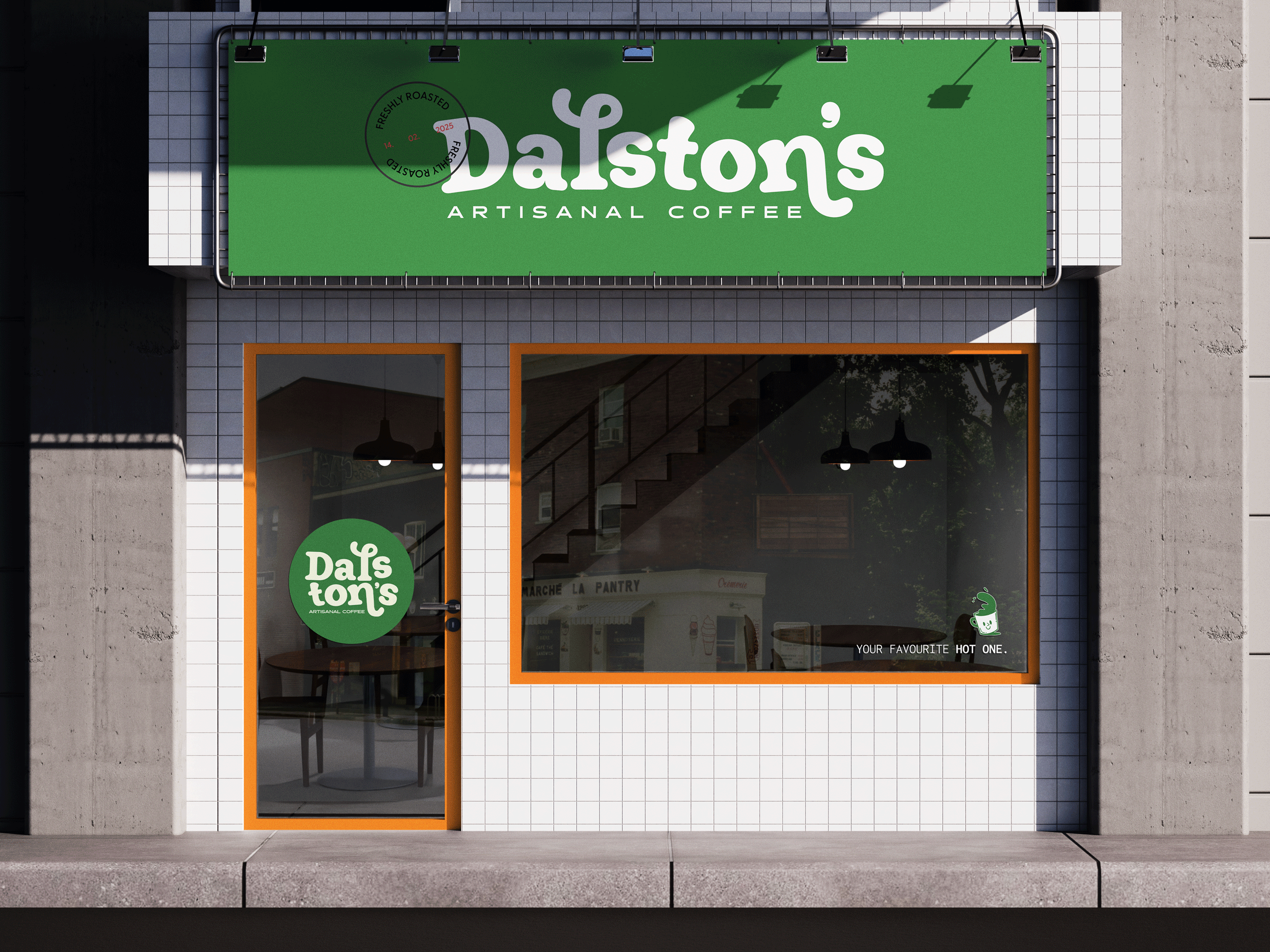
The identity is supported by a punchy green and orange palette, allowing the logo to flex between bold and friendly or vibrant and energetic depending on context. The result is a memorable wordmark that feels artistic, modern, and unmistakably Dalston’s — a visual handshake before the first sip.
Packaging
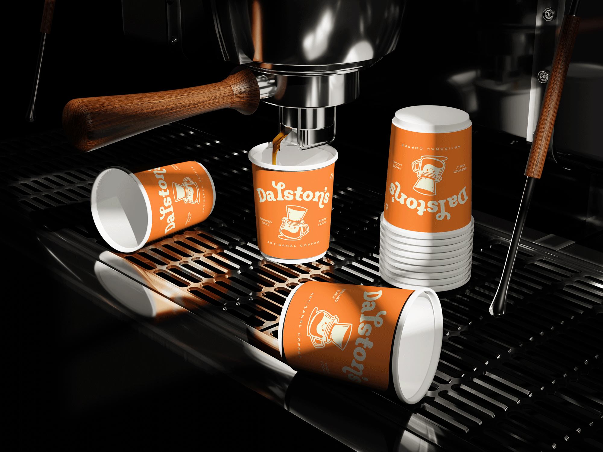
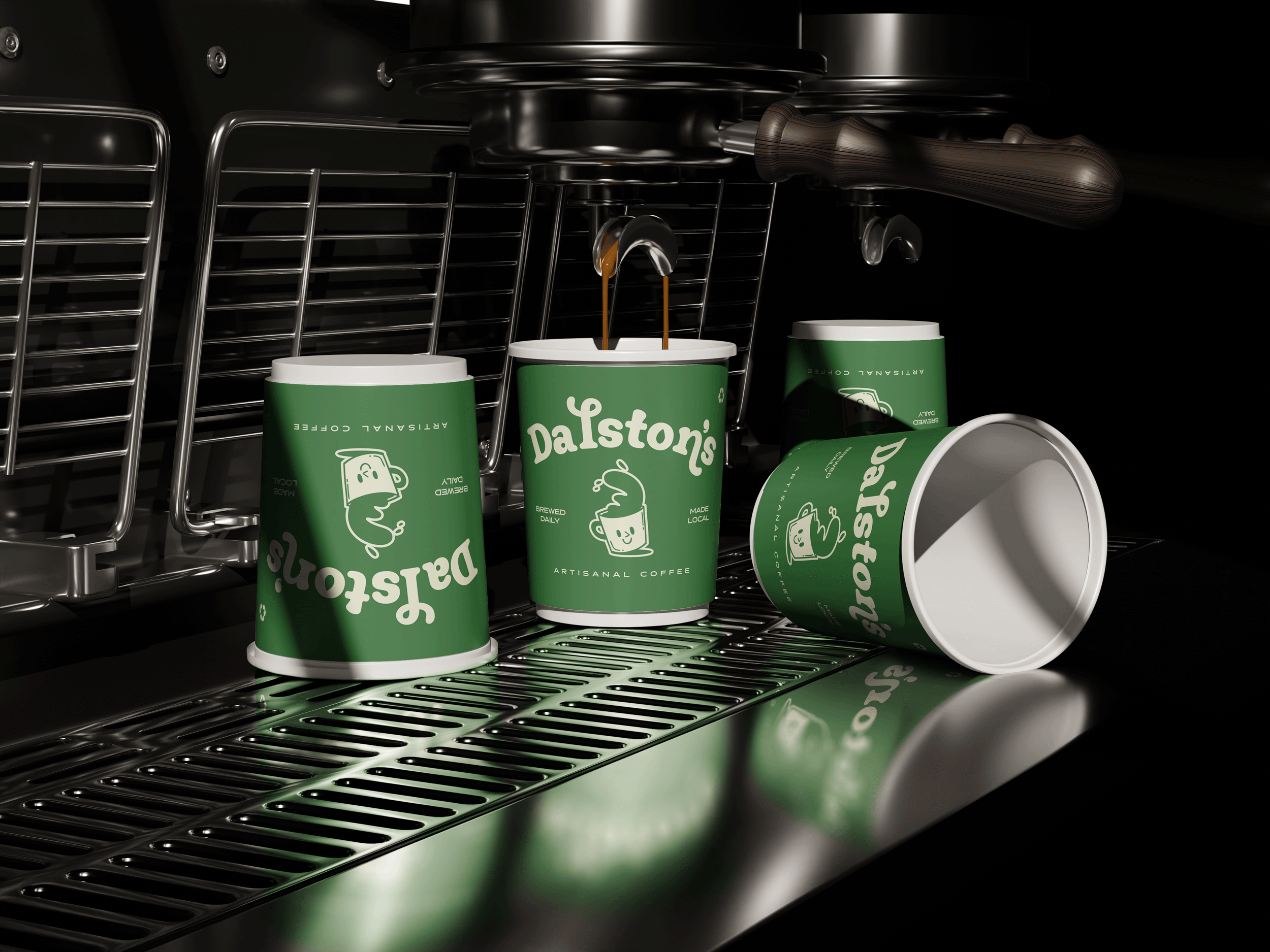
Dalston’s packaging leads with attitude. Each cup features a quirky drip-coffee character — bold shapes, expressive faces, slightly imperfect lines. All intentionally designed to feel human and handcrafted.
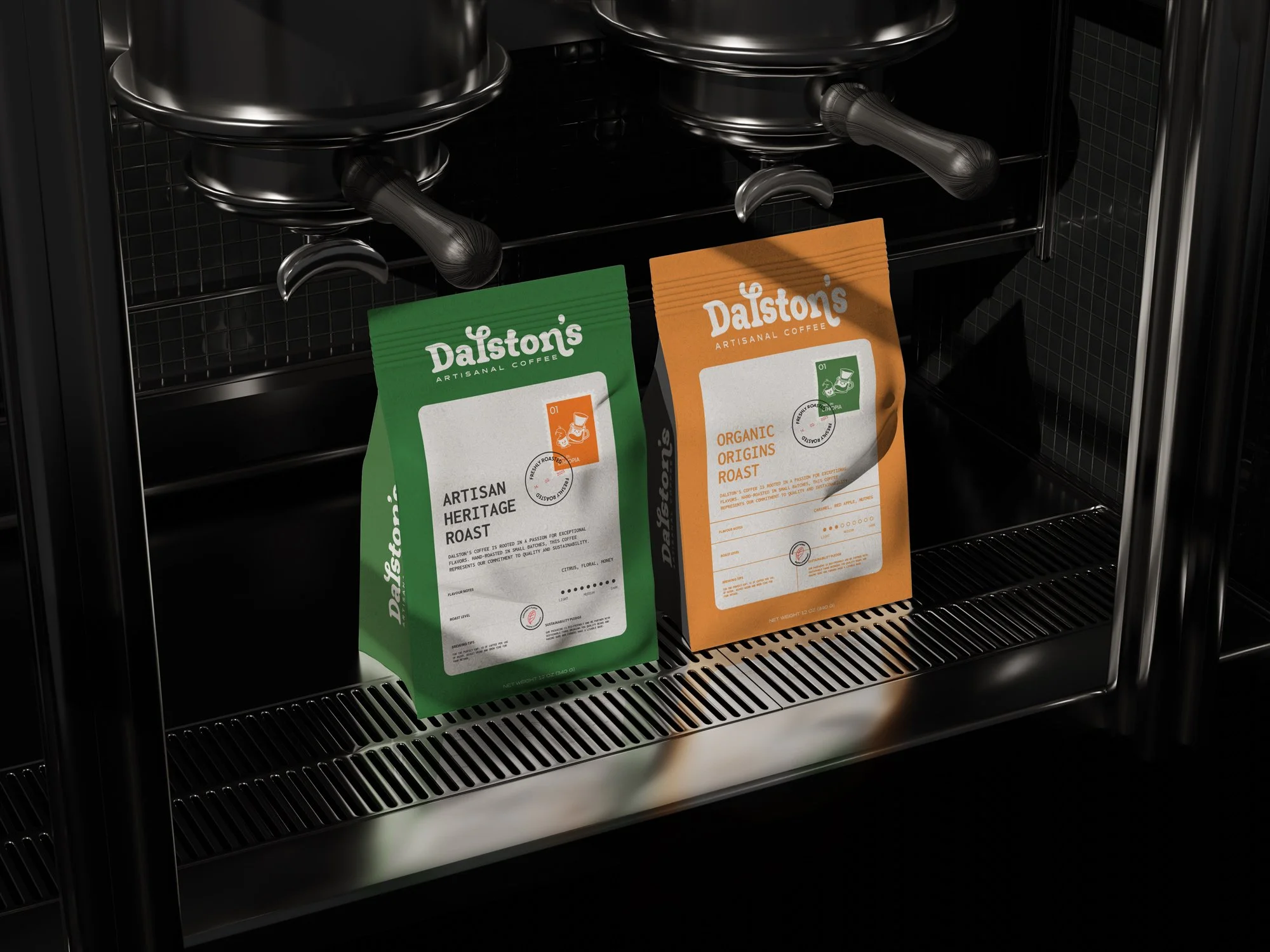
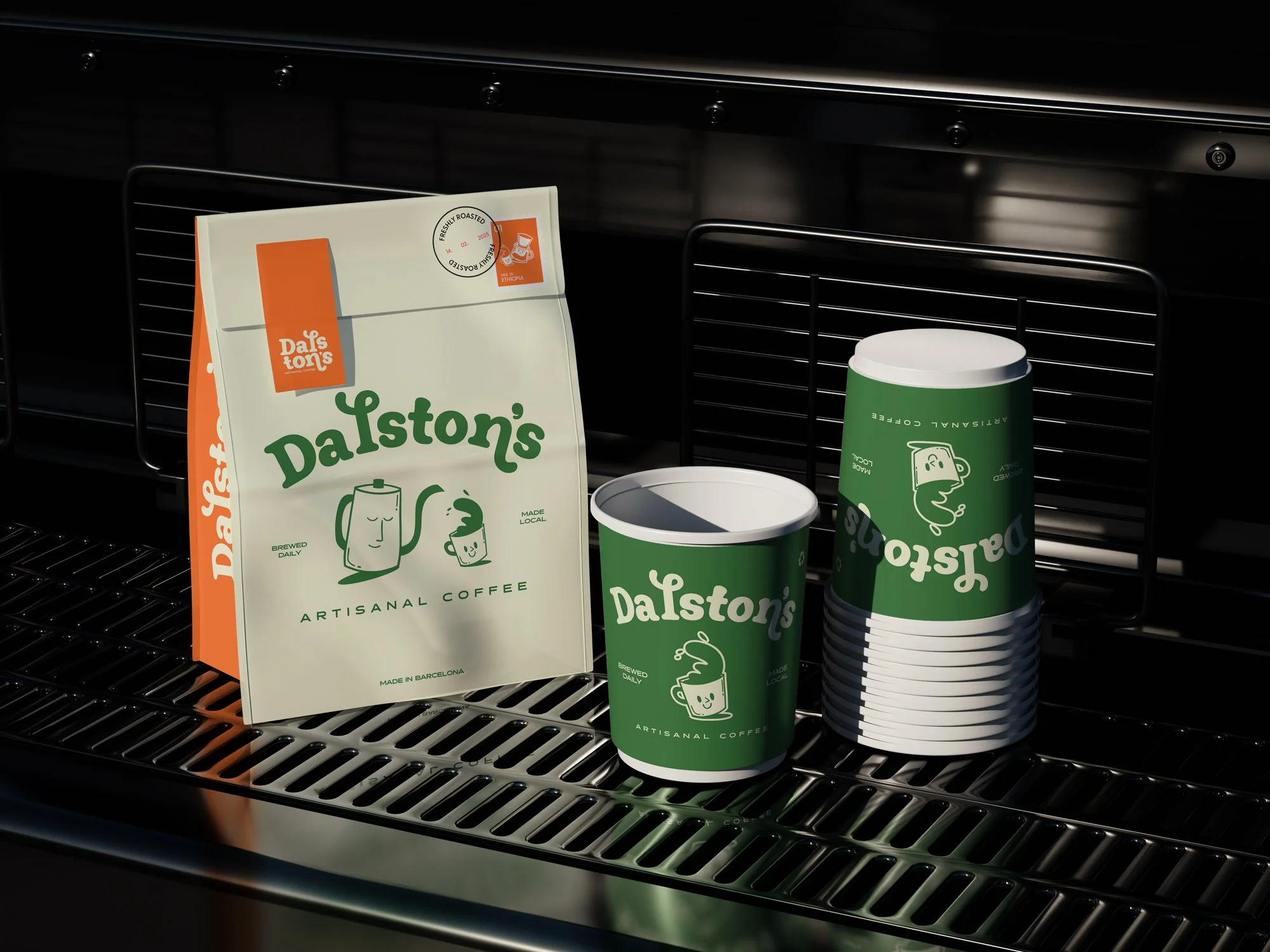
The system is playful without being chaotic. Strong compositions and a punchy green–orange palette keep everything feeling cohesive, even when the illustrations are loud. It’s bold enough to catch your eye on a crowded shelf, but considered enough to still feel premium.
The cups don’t just carry coffee — they carry character. They feel like something you’d want to show a friend, not just toss in the bin.
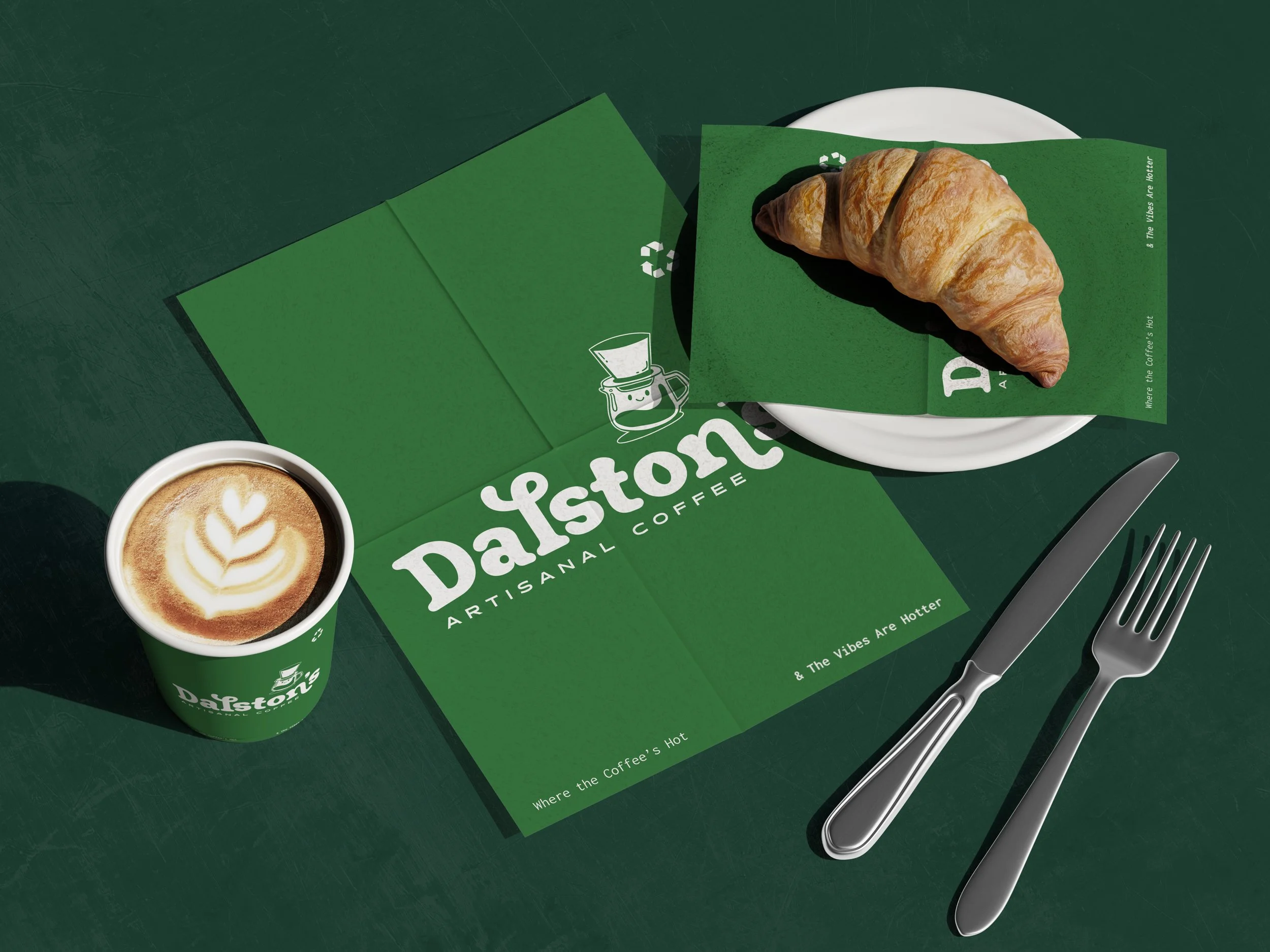
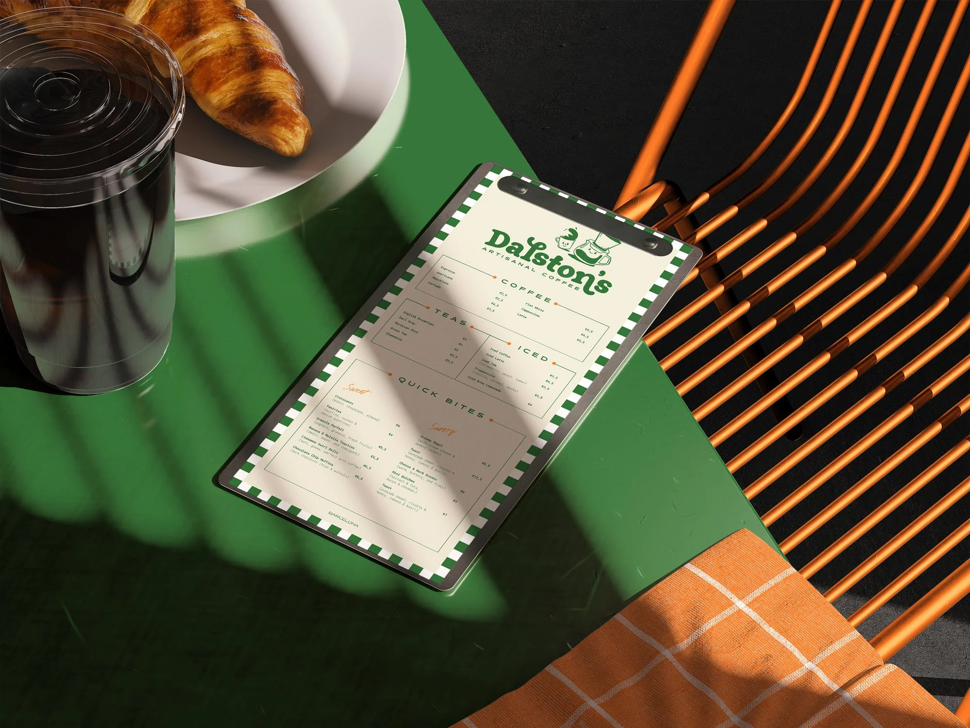
Maintaining a clear visual language across every touchpoint is essential for Dalston’s. Cups, menus, napkins and coffee bean bags all speak the same visual tone, proving that the identity is scalable and recognisable at a glance.
From ordering at the counter to carrying beans home, the brand stays present without overwhelming the experience. It’s playful at its core and considered in its details — designed to make everyday coffee moments feel just a little more memorable.