Microsoft
Roles & Deliverables
Graphic Design
Brand Background
Microsoft is a global leader in technology and digital innovation, developing tools that power both everyday users and enterprise-level systems. With a strong focus on accessibility, productivity and responsible AI, the company continues to evolve how people learn, work and interact with technology.
Visually, Microsoft’s brand system is structured, clear and highly scalable. For this project, we explored how that established identity could be reinterpreted for educational content — bringing energy and human connection into technical subject matter.
Project Overview
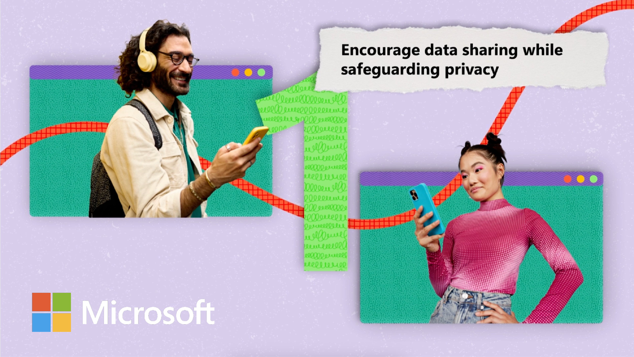
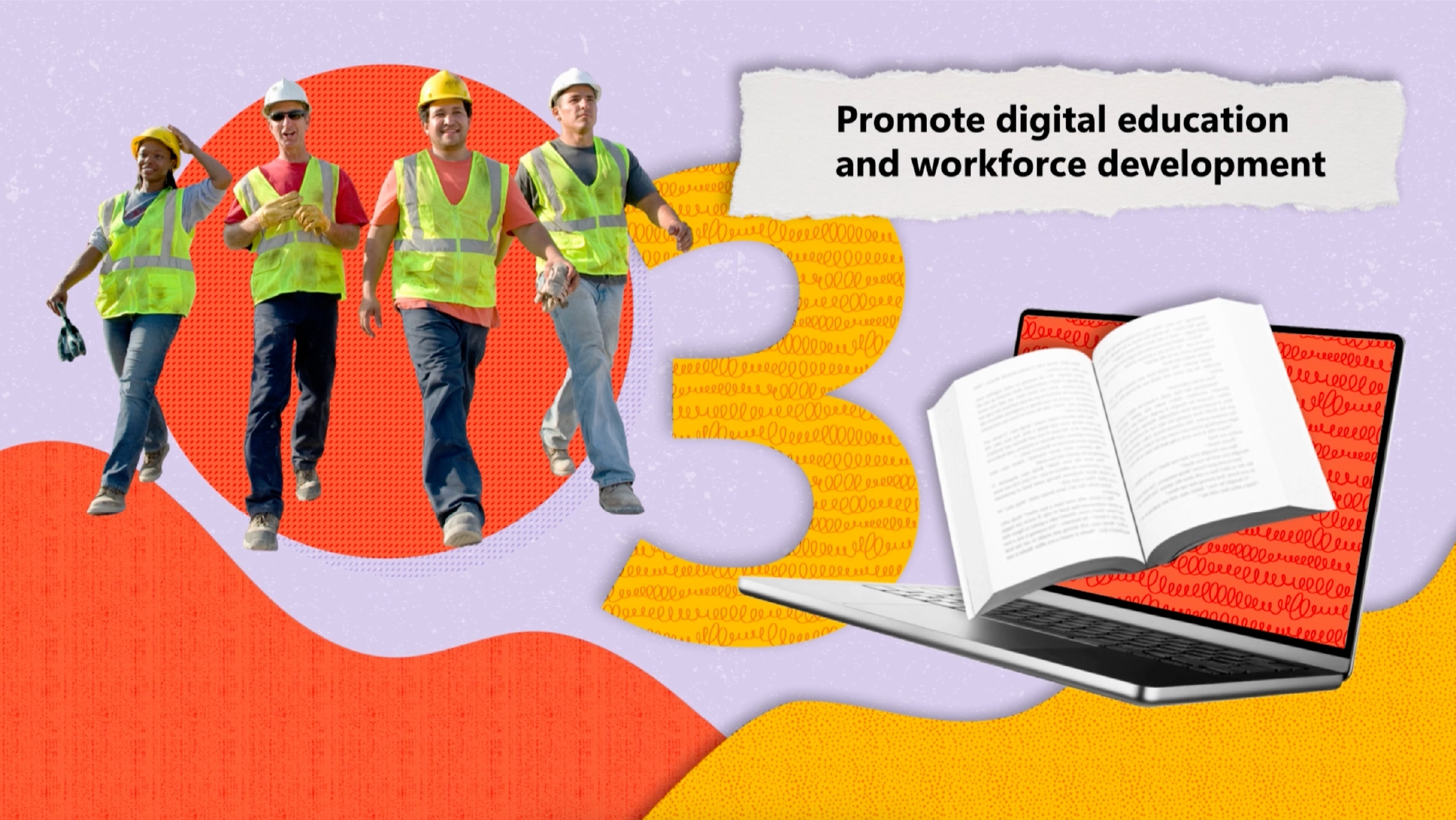
This project centred on designing a full visual system for Microsoft’s AI e-learning series. We created a series of over 50 training videos built to educate teams across multiple regions. The objective was to make complex content approachable and engaging, without compromising clarity.
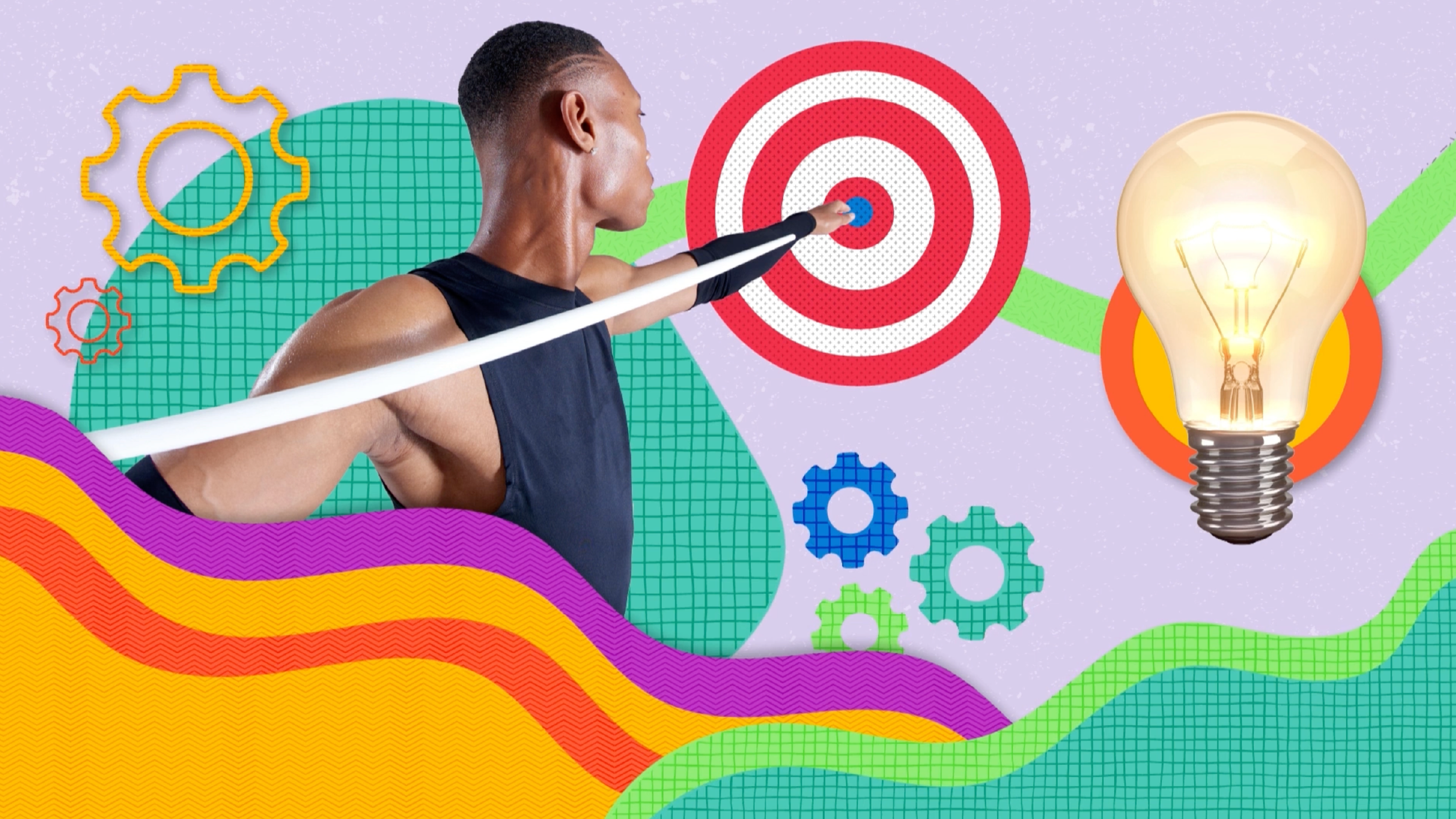
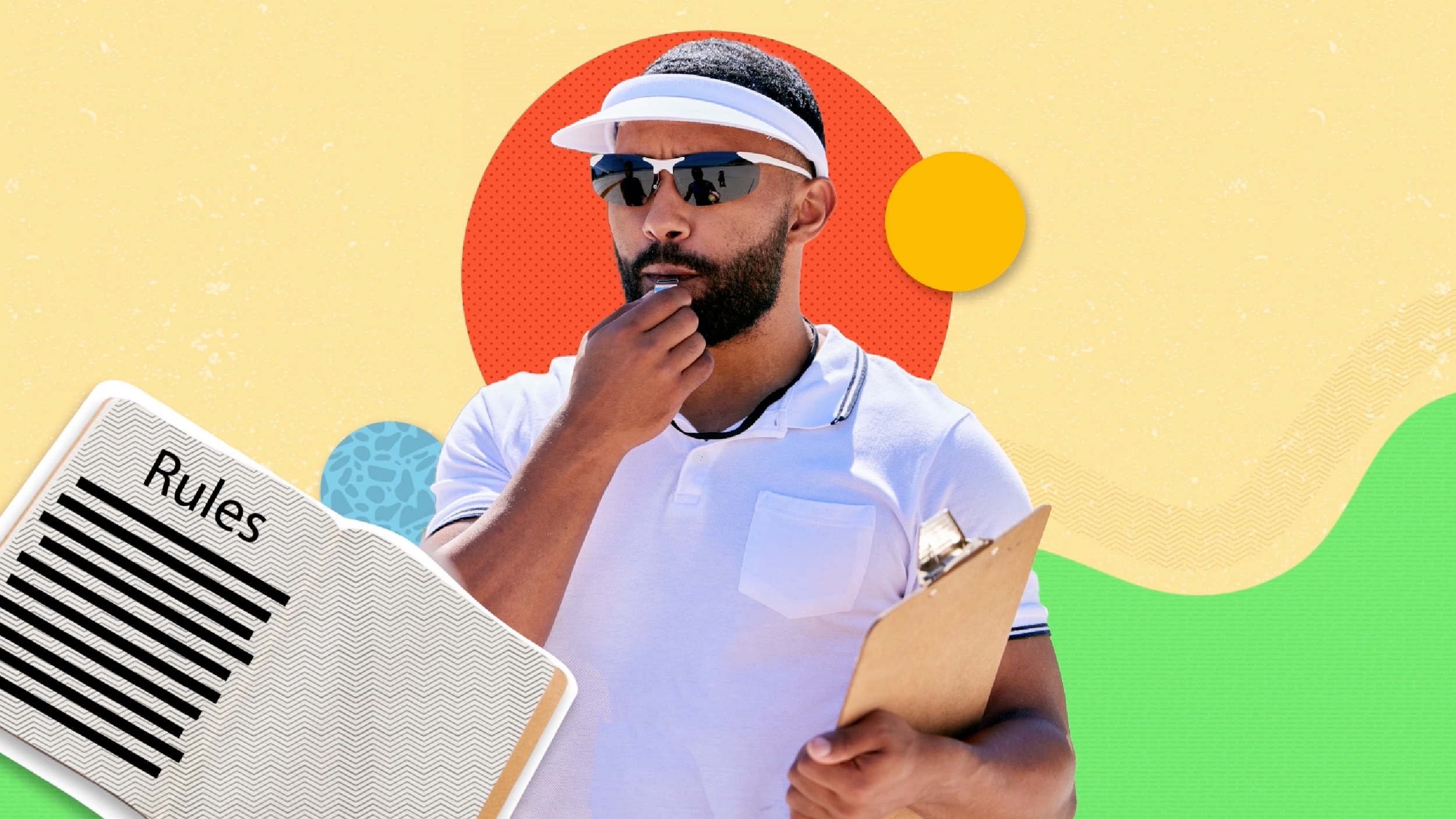
To achieve this, we introduced a collage-inspired style using Microsoft’s brand colours, graphic patterns and motion to build a dynamic learning experience. The result was a fresh visual language that felt informative yet human — one that captured attention, supported narrative flow and aligned seamlessly with Microsoft’s brand foundations.
Challenges
With over 50 videos in production, there were many moving parts to coordinate between design and animation. The timeline was tight, which meant our team had to maintain a fast pace while ensuring every file was clean, organised, and ready for handoff. Keeping layers structured for animators and meeting each delivery milestone required precision, teamwork, and clear communication across all stages of production.
Visual Language
To bring energy to the learning experience, we built a collage-based visual system inspired by physical cut-outs. The aim was to add a sense of tactility and human touch to a highly technical topic — making AI feel less abstract and more approachable.
Bold colour blocks taken from Microsoft’s palette were layered with graphic patterns, gradient textures and paper-like elements to create depth and movement throughout the videos. Each sequence was designed modularly, allowing content to shift, unfold and build visually as the narration progressed.
The collage style also allowed for flexibility. Key themes could be highlighted through layering, scale and composition — making complex topics easier to digest while maintaining strong visual rhythm. The result was a recognisable visual language: playful in aesthetic, structured in function, and easy to adapt across over 50 video modules.
Client Feedback
The client responded incredibly positively, noting how the visuals brought fresh energy to their e-learning content. They loved the balance of creativity and consistency and how seamlessly the motion graphics aligned with Microsoft’s brand personality. The project wrapped up smoothly and on schedule, with everything delivered neatly and ready for rollout.


